During the solemn and momentous ceremony announcing the official merger and renaming of the institution, Nghe An University formally introduced its new logo and brand identity system. This event represents a pivotal milestone in the University’s ongoing journey of innovation, integration, and advancement, while also contributing significantly to the enhancement of its institutional image and visibility within the academic community and the broader society

The new logo reflects a harmonious blend of regional cultural elements and modern design, symbolizing the university’s growth, innovation, and commitment to academic excellence.
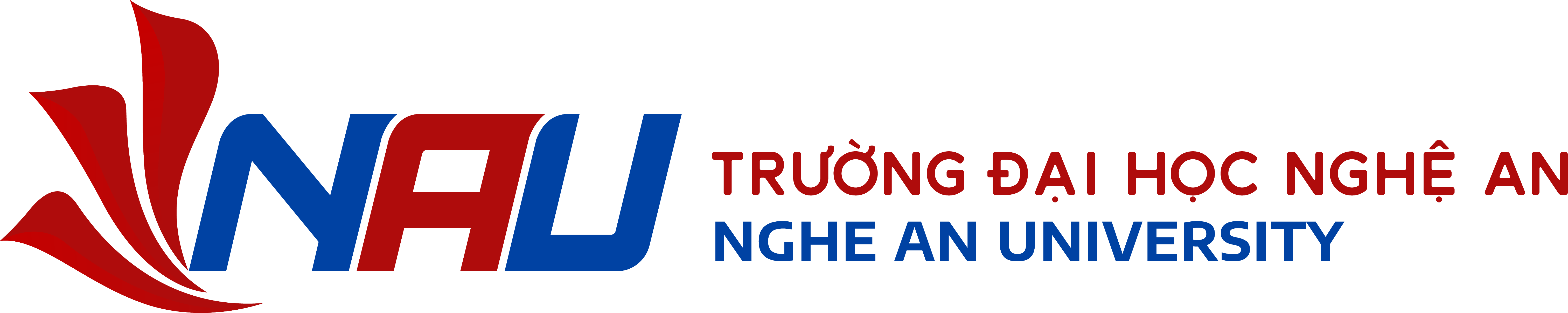
The NAU Logo – A Symbol of Identity, Aspiration, and Knowledge
The NAU logo, featuring a stylized three-petal lotus, embodies the cultural essence of Nghe An Province – the beloved homeland of President Ho Chi Minh. Each lotus petal carries a symbolic meaning:
- Enduring Knowledge
- Diversity of Disciplines
- Aspiration for Growth, represented by the upright petal resembling a flame of knowledge burning brightly.
- The modern, bold lettering of “NAU” (Nghe An University) combines the vibrant red of passion and dedication with the blue of trust and hope. Together, they reflect a harmonious blend of tradition and modernity, local identity and national vision.
![]()
More Than a New Look – A Declaration of Identity, Vision, and Aspiration
The new brand identity of Nghe An University is not merely a change in appearance — it is:
✅ A Statement of IDENTITY – Affirming the university’s core values and institutional essence.
✅ A Commitment to VISION – Striving to become a leading center for education, research, and innovation in the region.
✅ An Expression of ASPIRATION – Empowering the young generation with knowledge and walking hand in hand with the nation’s development.
With this new identity, Nghe An University aims to further improve the quality of education and continue contributing to the sustainable development of society.